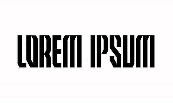
Around the start of September 2023 Elliot and I were talking about how it could be so cool to have a custom font for a Jersey, Which grew into far more than that and eventually became a visual asset for G2 and the Design team.
Timeline and plan imagery
We knew we wanted the font to SCREAM G2 Samurai to the max. But most importantly embody the mask, that was a must. We started playing with the same angular motion of the mask, how its mirrored and how this could translate into a font. We hit a stump and knew we needed to create some simple ruling that could stand true throughout. Which is where we needed the help of Zanne who essentially set us straight. She gave us 3 simple rules to stick to and keep true:

“1. Readable and accessible (think about where it will be used most)
2. Feels fluid/smooth especially in cases where we will be using it everywhere
3. Unique, which doesn't mean every letter needs to be, just the overall feeling needs to be.”
2. Feels fluid/smooth especially in cases where we will be using it everywhere
3. Unique, which doesn't mean every letter needs to be, just the overall feeling needs to be.”
So keeping that in mind we still, as previously mentioned, wanted to develop a true rule set for us.
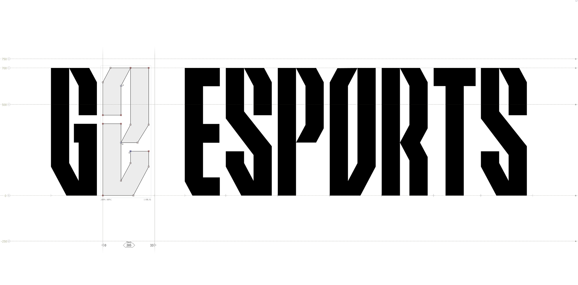
So we settled on a few rules:
- Consistent angling
- Negative space emulate samurai swords
- Points meet at the top of each letter rather than flat blocks due to exceptions (T, Z, E. F)
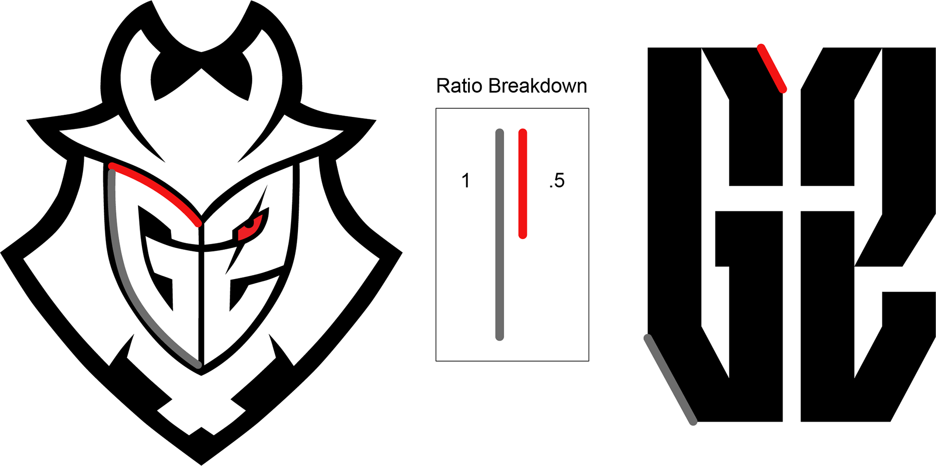
- Last but not least G2 Mask and its personality are visible throughout. This was by taking the proportions and ratios from the mask.
- Negative space emulate samurai swords
- Points meet at the top of each letter rather than flat blocks due to exceptions (T, Z, E. F)
- Last but not least G2 Mask and its personality are visible throughout. This was by taking the proportions and ratios from the mask.
With these rules in mind and Zanne’s godlike guidance we went for round 2.
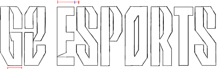

We honestly struck gold, this for our first real attempt was so close we really believed in this direction. So we got to testing. Checking the clarity of each letter, developing the formula more and more.
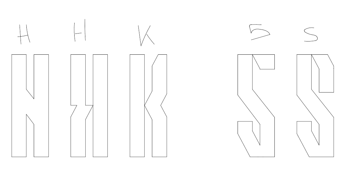
We realized that there came challenges with creating definitions
between H and K also S and 5. (And many more)
But after all of that we really truly believed we had nailed it in a super short time frame. Creating a beautiful font and a beautiful visual asset to help be a catalyst to grow the G2 brand